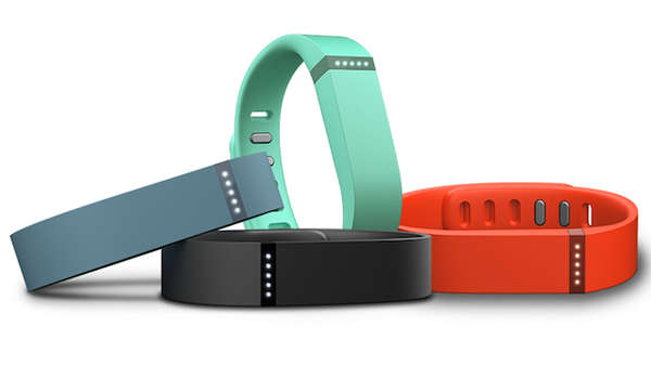
 As part of our research for Vivametrica, I purchased a Fitbit Flex – a wireless activity tracker. Well actually, I first purchased a Fitbit One but promptly lost it.
The One fell off somewhere between my house and gym – the very first time I wore it, leading me to doubt the practicality of the hip worn clip.
This is what lead me to the Flex, which is wrist-worn and appeared to be more secure.
Given that to date I have only used the very practical-looking research grade activity trackers I was quite excited to get my hands on a Flex.
They come in PINK, you know (and purple, and turquoise)! I may be a scientist but I am also a woman who likes colour.
I have been using the Flex for about a month now and here are my initial thoughts (from the perspective of a consumer, not an exercise scientist.
WHERE TO GET IT: The Fitbit is widely available for purchase in Canada, which makes it convenient. I bought mine at the Apple store but I have also seen them in Shoppers Drug Mart.
THE DEVICE: The Flex is a wrist band made of a rubbery material. It comes in cute colours….and also plain black for the gents. It is a little bulky for my liking and not quite nice enough looking to leave on when I am getting ‘dressed up’. It took me a while to figure out how to get it to clip on. I may be somewhat lacking in fine motor skills, but either way this was frustrating. One major advantage is that it is water resistant. I wear mine in the shower and it seems fine so far!
SET-UP: The set-up is relatively seamless. You download the API to your computer and sync your device using a small wireless dongle that plugs in via USB. The dongle is TINY and I can see it getting lost easily. I have not lost mine as I just keep it plugged in at all times….but this may not be practical for everyone.
ACCESSING YOUR INFO: When you want to upload your information, you click on the Fitbit icon on your desktop and sync your device. However, if you want to ACCESS this information you must then log in to the Fitbit website. This will take you to your own personal ‘dashboard’. This is one thing that I am not particularly impressed with….I would like to be able to sync my device and receive all of my information immediately, instead of syncing and then logging in to the website.
THE WEBSITE: The website is relatively straight forward and cheerful looking. Your personal ‘dashboard’ is easy to navigate.
THE APP: There is a Fitbit App. To be honest I only opened it once. It provides the same information as the website, but using my older version iPhone (4S), I cannot sync my Flex directly to my phone. I would really like to be able to do this!! I believe that with newer devices you can sync using Bluetooth.
WHAT INFO DO YOU GET? This device tracks physical activity and sleep. I have not used the sleep tracker yet so cannot comment. When you log in you get to see your steps, miles walked (I am sure I could switch it to KM somehow!), number of active minutes, and calories burned. You will also be sent emails providing you with ‘badges’ when you reach certain thresholds (e.g. first 10,000 steps). When you reach daily goals you will also see flying happy faces on your dashboard – I am not sure about other users, but they do make me smile!
THE DISPLAY: The display on the device is a series of 5 dots. When lit up, each dot represents your reaching 20% of your daily goal (mine is 10,000 steps for example). I do like the dots idea and it makes things very simple. Once you have reached your goal the wrist band buzzes and the dots flash So far this has been enough of a motivator to get my butt moving! There is no text on the device screen so you cannot see the number of steps you have taken, calories burned, the time etc. As mentioned you need to log in to see any data.
GOALS: You set your own goal, which for most people might be difficult. Most people have no idea how many steps they should be taking. The default is 10,000 steps, which is a widely used goal….but physical activity goals should not be one-size-fits-all.
PROS: Easy to buy, cute colours, water-resistant, easy set-up and sync/ABI function, good website, lots of feedback and motivation (the 20% dots, emails, happy faces etc.)
CONS: A bit bulky, the need to sync and THEN go to the website to access information, cannot sync with older smartphones, arbitrary goals, need to buy Premium version to access more depth of analysis.
SUMMARY: I like it. I will continue to use it for a while at least. However, I want to know more about what the information MEANS for me. It may be that the Premium version provides this depth of information, so I will do the free trial and report back.


